Timbuk2
I got to work with the classic urban travel brand Timbuk2 to revamp and relaunch their eCommerce experience.
Our challenge was to celebrate the beauty and vibrancy of the brand, its products and customers through cutting edge technology and a fresh design language. The design needed to be highly flexible to accommodate the need for constant content updates.

Creating a Visual Language
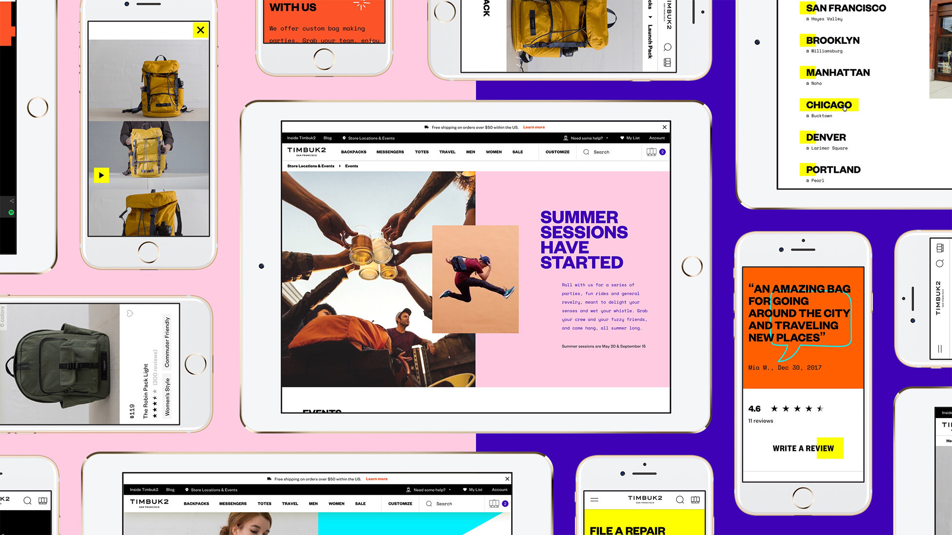
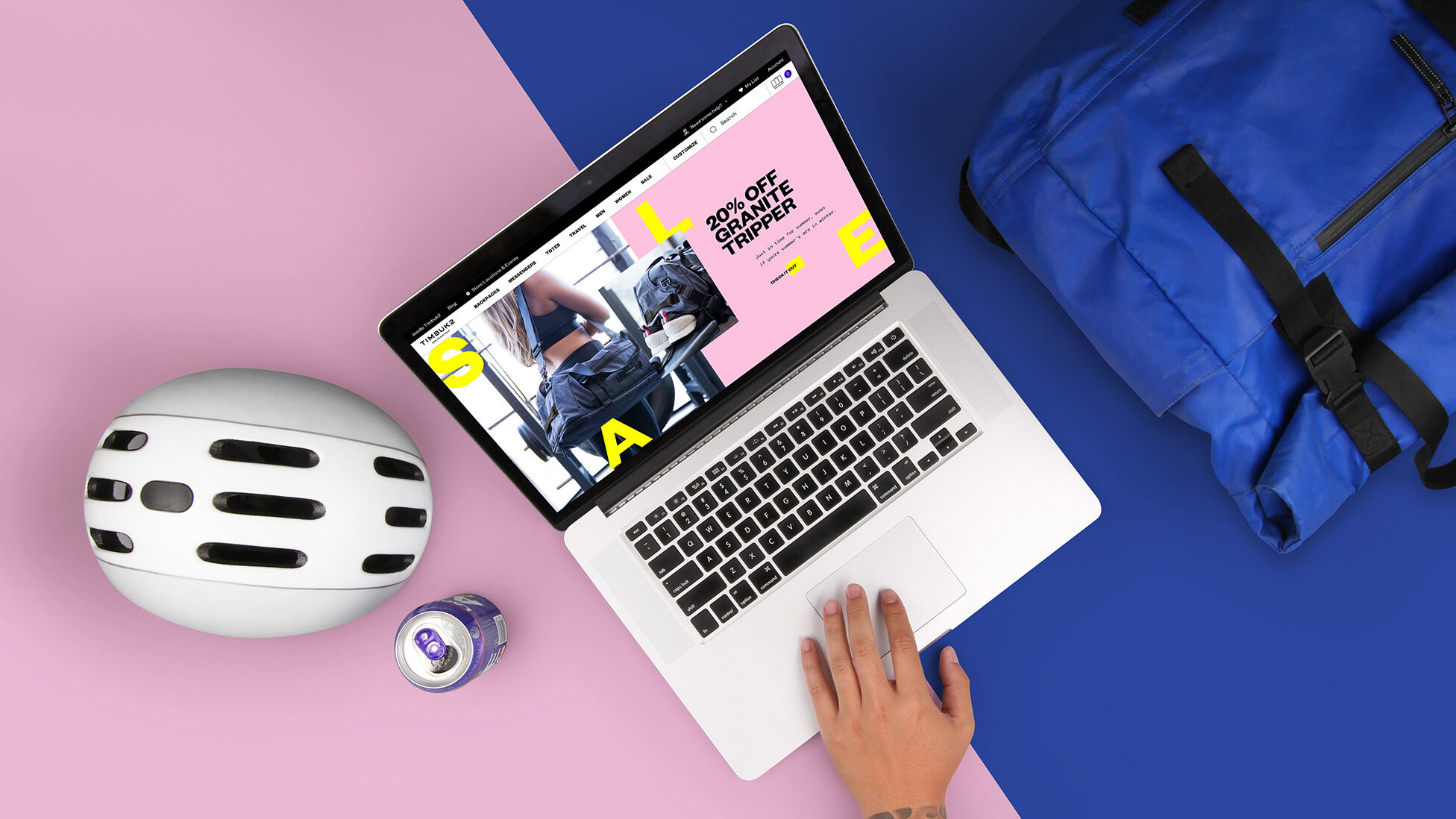
By honing in on the essence of their complex character we developed a systematic design language as versatile, bold, and progressive as their customers and products. With a side-by-side diptych, the design showcases not only the bags in all their glory but also the creative ways their customers wear them — painting a comprehensive portrait of the urban culture of the Timbuk2 community.
The System
The split-swatch layout is a flexible framework designed to adapt to constantly changing content with ease. Both blocks can be filled with lifestyle photography, pattern, illustration, text or a color block. A detail module brings depth and further insight into the the content it accents.